Today’s pretty inspiration shoot is a bit different. It uses a pretty coral color palette, but love that the team designed to share the same palette in two different styles! One a bit more modern and one a bit more traditional, but both are colorful + fun! A bit more about why the two different styles…
From Events Luxe, Why did we want to showcase two different styles and demonstrate how to achieve them? Simply because we find the most difficult part of planning a wedding for brides is staying cohesive in their styling so that every element compliments the other. We wanted to break the styling down and make the differences more obvious by keeping colors and the floral topper the same. While the colors are the same, the color proportion is not. Color proportion is a key element in the overall style impression of an event. Our florals were the same throughout – thus showing you don’t have to have “modern flowers” or “traditional flowers” to create your look. We also used a unique color combination of poppy red, coral, and blush to showcase how you can use vibrant and interesting colors without going overboard or looking too contrasting. We used Chiavaris in both scenes, however we used gold in the Traditional scene, and clear/crystal for the Modern. This chair silhouette can go with everything! It’s a very popular wedding chair. We don’t believe “Modern” has to mean stark or neon or chevron, we wanted to show that modern can be done romantically. Our view is that what is modern and what is now, is using different inspirations from different eras and putting them together in a smart way.
Thanks to Jordan Brittley for the lovely photos!
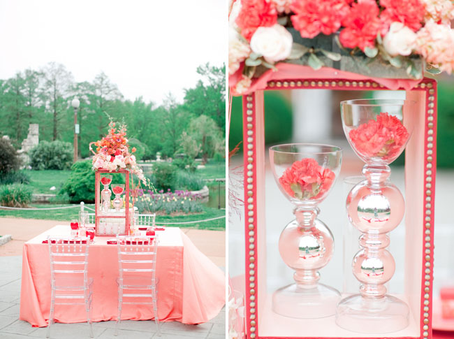
Our modern side was meant to show what we define as “modern” – which, currently, is taking different eras and inspirations and putting them into a clean palette, using a bolder base tone, and incorporating elements people don’t see all the time (keyword: unique).
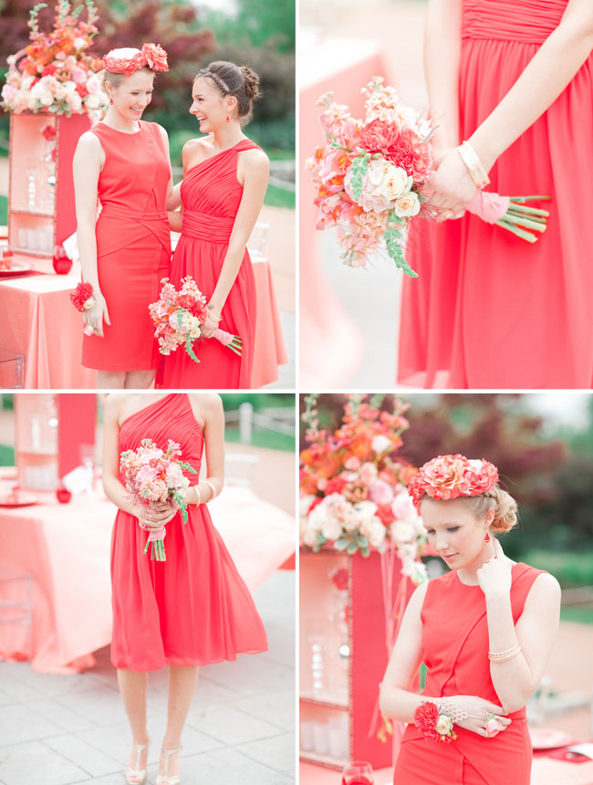
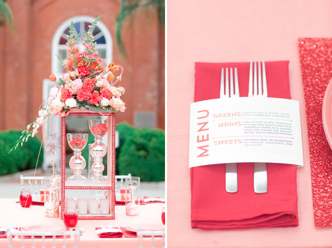
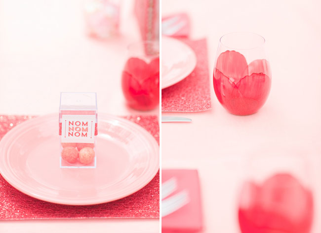
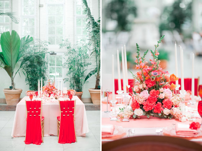
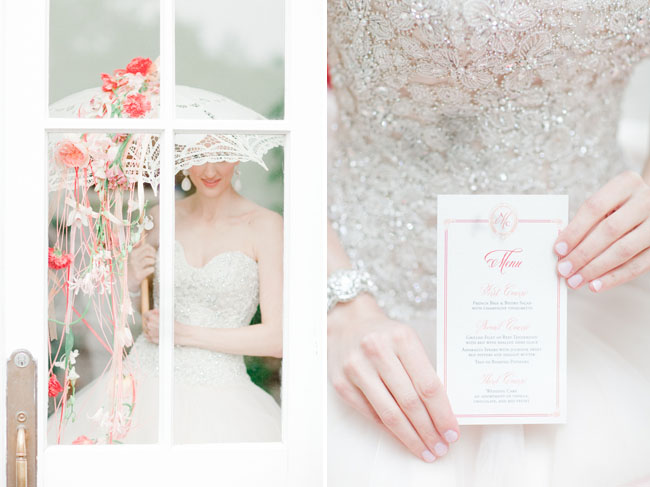
For our menus, table numbers, and favor tags, we utilized a simple and modern typography and layout, and kept the lines on the table simple. The floral centerpiece is placed on a red leather riser with nailhead trim (made by us) which was then filled with more flowers and candles. Placemats are large square glittered cardstock available at craft stores! The bridesmaids are bold in their poppy red dresses, and as an alternative to two bouquets, one bridesmaid carried a bouquet and the other wore a fresh flower hat and flower ring, showing a bridesmaid doesn’t have to hold a bouquet to look the part.
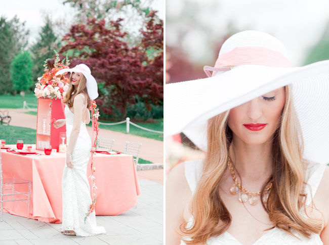
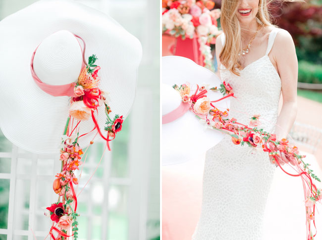
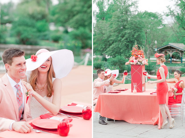
The bridesmaids in this scene do not have matching dresses. We used the same poppy red color but chose contrasting dresses to show that a balance can be made even if you use different fabrics or silhouettes. The bride also wore a hat, customized with fresh wedding flowers cascading into a train as an alternative to a bouquet. Her dress was a simple silhouette with beautiful modern eyelet-style lace. (Yes! Lace can be “modern”!) The groom wore a light coral jacket with gray slacks which showcases a modern take on the traditional groom or groomsman style.
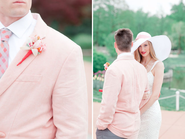
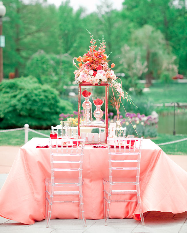
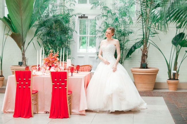
The red “leather” riser on the modern table was made by us, starting from bare wood planks. The box was assembled, then covered in vegan pleather, trimmed, and the nailhead trim was applied in a fun geometric pattern to one side. We didn’t DIY the modern placemats, but we created the idea of placemats out of using craft store glitter paper, something we think is pretty fun. The hats were made by the florist but could be done by any crafty bride with the motivation!
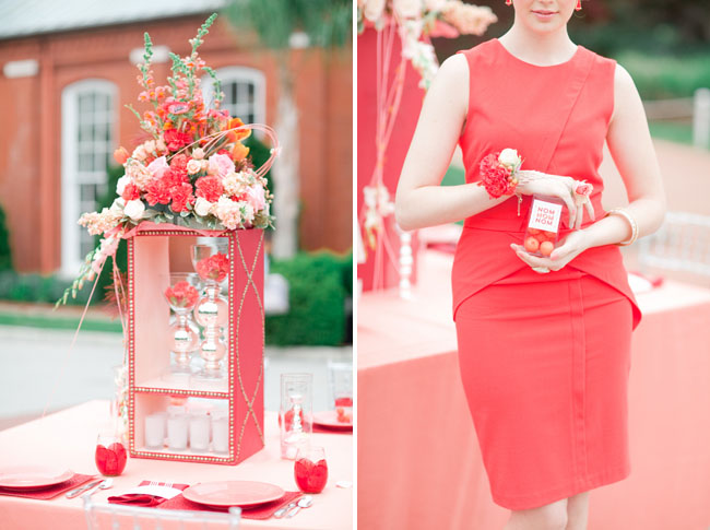
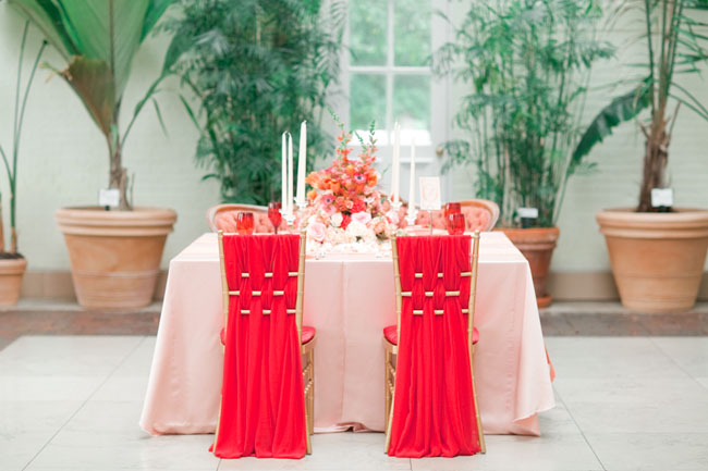
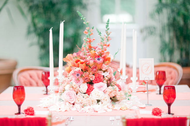
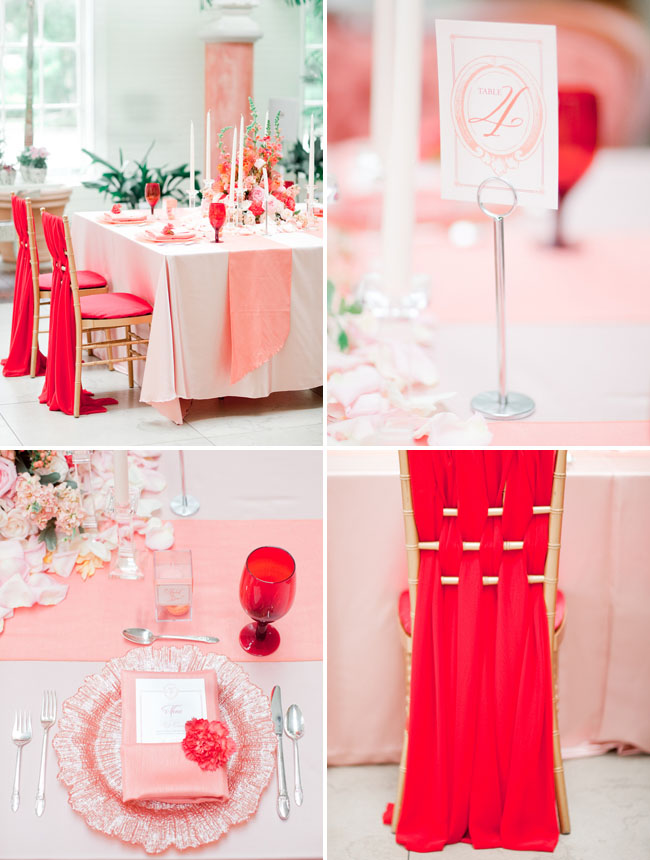
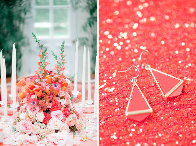
Our traditional side was designed to showcase the same exact color palette, utilized in a more traditional-wedding way while still looking unique and stunning. The same floral topper from the modern centerpiece is utilized, placed directly onto the table and surrounded with romantic rose petals and tall ivory taper candles (be sure to ask your venue about their policy on open flames!). Two table runners are used on this table, laid parallel to one another, which is a more current take on the commonly-seen single runner, or crossed runners, which we thought was fun to showcase on a traditional-style design. The chairs are Chiavari, decorated with bright poppy red chiffon, while the opposite side of the table has vintage seating – a coral loveseat. Menus, favor tags, and table numbers utilize a script font with a monogram, and menus are placed inside the napkin and topped with a rose. Instead of placemats like on the Modern table, we used beautiful blush chargers with a romantic floral shape.
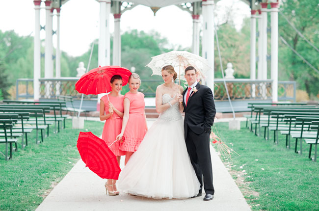
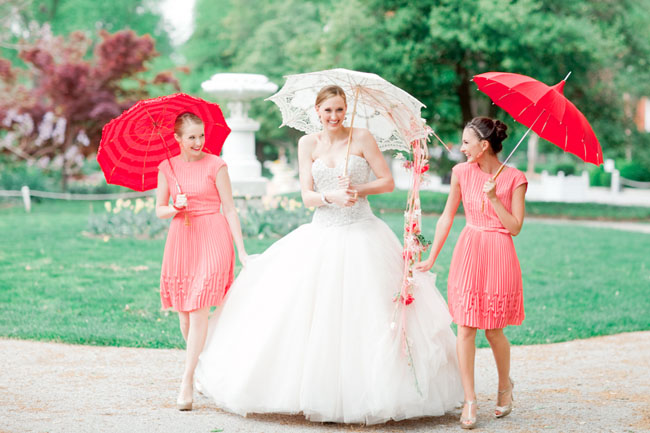
The bridesmaids wore matching coral pleated dresses and carried bright poppy red parasols as their accessory. The bride wore a stunning blush pink ballgown with a heavily embellished and crystal encrusted bodice. This strapless ballgown silhouette is more bridal-traditional, contrasting with her modern look which was simple and had slightly more casual with the satin straps. Along with her showstopping blush ballgown, the bride carried an ivory lace parasol, with fresh florals draping across one side! It was a gorgeous and unique look.
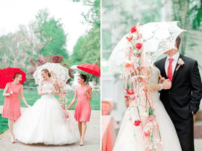
Love the parasols? We have a pretty lace parasol and poppy red parasols in The GWS Shop!

Isn’t that umbrella with flowers so pretty?! If you love these colors, check out our Get the Look for this shoot!
Thanks so much to all these creative artists for sharing their talents with us today!

photography: Jordan Brittley // venue name: Piper Palm House // hair stylist: Lalo Salon // makeup artist: Lalo Salon // linen rentals: BBJ Linens // event planner: Events Luxe // floral designer: The Crimson Petal // umbrella rentals: Bella Umbrella // rentals: Finch Vintage Rentals, Premier Rentals // dress store: Simply Elegant Bridal // paper props: Ten Four Paper
Lovely! I was looking at this shoot and dying over the location…and then I realized it’s MY ceremony location! Totally didn’t even recognize it at first.
Wow, so much gorgeousness! Great job vendors!
The White Taper Candles with Red accessories works extremely well. We ship out many of these for weddings this time of year.
I loved being a part of this shoot! Thank you so much for featuring it! Would you mind linking to my website at http://www.tenfourpaper.com? Thank you!!!
Really enjoyed this shoot; would love to see more color schemes, patterns, or inspiration objects styled two ways.
YAY!!!! Finally some St. Louis Tower Grove Park love on GWS!!!! So happy to see my favorite park showcased so beautifully. :)
Not only do I love the parasols, but I can’t get enough of the flower vines added to it. I’ve never seen that before!
I love the poppy one shoulder bridesmaid dress — where can I find this?
This is gorgeous. My favorite part? The menus! The florals are pretty spectacular too, and love that parasol!
I am obsessing over the pleated coral bridesmaids dresses. Can anyone provide more details on designer? Thanks!
Thank you so much for the lovely feature Jen! xoxo
Wow, these colors are fabulous!
Please do a DIY on the hat or the umbrella. Gotta know how to make that :)
Thanks for all the amazing comments on our work. Makes us smile for sure.
As for a DIY on the umbrella or the hats – I created a basic armature for these to rest on, and designed it all from there. I was honored to take and advanced design class from the great Gregor Lersch, a German floral designer who inspired a lot of the ideas here.
Kelly, your designs are beautiful and I love the way you have incorporated the flowers on to our parasols. Itoo haven’t seen that done :) It made me smile when you mentioned Gregor Lersch; before I created Bella Umbrella 11 years ago I was a floral designer and I too studied with him…isn’t he just the best?!
I love the coral pleated bridesmaid dresses. Where can I find them?
Hi girls – there were some questions about the bridesmaid dresses. Here you go!
Coral bridesmaid dresses: Ted Baker London, Nordstrom.
Poppy Red bridesmaid dresses: Donna Morgan & BCBGMAXAZRIA, Nordstrom
Love the poppy red and coral color scheme. It really brightens up the pictures!
These colours are magical- could eat them! What a beautiful set up. Thanks for this
Simply gorgeous! The colors are simple but that’s what makes them pop! Keep up the great work.